I chose to research this because I've become really interested in it since doing a web design placement.
First Website
The first ever website was actually about the World Wide Web by Cern, with lots of information on it including how to use it and what you can do with it.
Here is a screenshot of the original web browser back from 1993.

Web Language
There are different languages used for coding to make a website do certain things. For example, HTML is used for saying what goes on the webpage, for example headings, paragraphs, links etc. Then you style these elements using CSS, and you can change the colors, borders, positions etc. Then Javascript is what makes elements interactive - for example sliders, drop down menus etc. There are other web languages such as PHP and jQuery, as well as languages for apps such as Ruby and Python.
I used a website called w3schools to learn html, and here is a description on there what HTML is:

Here is some of my own HTML from the first website I made.

Here is some of my CSS:

When I was on my placement I was given a fictional project to make a Doughnut Company website so I could learn how to code. I did all of the HTML and CSS, but it isn't completely finished as I didn't learn how to use Javascript and PHP, to make it interactive and for the forms to work.
Doughnut Website

Wire Frames
Wire frames are what designers use to sketch up designs for webpages, and usually have a grid on them.
Here is an example I found:

They are really helpful for figuring out what information will go where, if it fits and the size of the content.
Things I've learnt
I've learnt a few things while I was at my placement which now influence me when I am designing.
The logo is actually usually quite small as at first I was making that a big focal point of my designs.
Also, one of the designers at my placement said he follows AIDA when he is designing which is:
Following what I learnt from my placement and looking at web design, I decided to find a couple of websites that needed updating, and redesign the home page. I wanted to do this to how much of an improvement I could make, and if there is any need for bad web design.
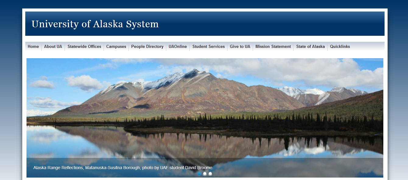
University of Alaska
I found an article on Design Shack called Best and Worst Design: 50 University Websites From 50 States. I decided to pick the one that needed improving the most to redesign, which turned out to be the University of Alaska.
Here was the screenshot of the site on the article:

And here is the current updated version:

I went onto Fireworks and came up with this, after drawing a couple of wireframes:

It's a lot more visual than the original two, without substituting any of the information. You can also see my project here on Behance.
A Vancouver Traveller Bed and Breakfast
I came across this website on webpagesthatsuck, which is quite ironic looking at their website. Anyway, I found a B+B website, that really needed updating to make it seem like a place you would want to visit, and was easier to read about it.
This is the website. It doesn't have a logo, the links are the default colour, and the background image doesn't match the subject, as well as the fact it is hard to read text over it.

This is my redesign. It is very compact, but gets all of the information you need immediately on the first page. This is important because people only a spend a few seconds looking at a web page, and either click on another link or go off it, so with having all the main points on the home page people are more likely to stay on it without getting bored.

I've also posted this project on Behance here.
Here are some examples of websites that I like:
I love the colours on this website. Even though it uses quite a few with the different background images, they are subdued and the opacity looks as though its turned down which works well.

This website helped me realise that to separate different ares on one page, it is a good idea to change the background colour of that section. As they all work well together, it doesn't look chaotic at all.

I love the use of colour and photography on this website, I think it's really professional.

I like the monochromatic colour scheme here, as the drink imagery stands out from the background which is what you want the viewer to notice.

This company is run by young people and is a contemporary, fresh restaurant. The website definitely reflects that and is minimalist in its design, and aesthetics is definitely a priority here.

I love how clean this website is, and looking at the whole website I think it has the right amount of information to be very informative but not over crowded.

I like the colour scheme and layout used here, as it's very modern and contemporary.

I like the functionality of this website, and I think it appeals to a wide audience as opposed to some of the more contemporary websites I've posted.

I really like the position of the nav bar on this website, and to me it looks like the position is fixed which I think would work well with this kind of website.

I really like the layout of this website, and I think the wide margins allow for the several pictures and text that full up the content as it doesn't look overcrowded.

I like the use of space on this website, and how it completely fills the frame. It is a very visual page, and I don't think it is something you could do for a text based website.

This website is very clean and functional, and I think it looks very professional and trustworthy because of the photography and simple layout.
.jpg)
Although this is quite a busy website, there is lots to look at, and the simple colour scheme makes it easy to read.

I like the bold use of colour here as well as the photography. It helps that the photograph has a narrow depth of field so that the text stands out against it.

I do like the navigation bar on the side, although I do think the margins are too wide on this website because the content does look quite squashed.

I love the simplicity of this website with both layout and colour, and I really like websites that have quite a long content with either different background colours or dividers for separating sections.

I love how this website realises that although it is featuring baby products, it is aimed at parents so is a professional and clean product, with no sign of clip art or comic sans.

This is a very professional and sleek design, and I think the simplicity and colours makes it look like an expensive brand.

Although I have become really interested in web design, and want to take it further, I am not going to continue my research and focus on it. I am still a beginner and I think it will be hard to make a website in the brief following this one as it will probably have a small timescale.
No comments:
Post a Comment